Most teams commissioning 3D renderings for architectural design think they are buying pictures. They are not. They are buying a decision-making tool that happens to look nice on the brochure. The render is what gets investors to commit, what gets a buyer to put down a deposit on an apartment that does not exist yet, and what stops a developer from finding out at handover that the entry sequence does not work.
That distinction matters because it changes what you ask for, what you spend on, and what you push back on when the studio sends a draft.
What 3D renderings for architectural design actually solve
An architect can read a plan, a section, and an elevation, and see the building in their head. Most other people on the project cannot. That includes the investor writing the cheque, the marketing team writing the launch copy, the broker selling pre-construction units, and the planning officer scanning the application.
Renders close that gap. A good set of images answers the questions a drawing package leaves open: how does this thing sit on the street, what is it like to walk up to the entrance, what does the south facade look like at four in the afternoon in October. Most investors will not spend an hour decoding elevations and sections. They will spend thirty seconds looking at a corner shot and decide whether the project feels real.
That is what you are paying for. Not the picture — the alignment it produces across people who do not speak architect.
Two jobs renders are doing on a typical project
On almost every developer project we work on, the rendering set ends up doing two distinct jobs. Mixing them up is one of the more common mistakes we see.
- Emotional images. These exist to make someone feel something — usually that they want to live there, invest in it, or approve it. Hero exteriors at sunset, an aspirational kitchen with morning light, the lobby at dusk. They are not factual diagrams. They are sales tools.
- Decision images. Site plans, unit-by-unit interior sets, balcony views from specific apartments, accurate shadow studies. These exist so a buyer (or a planner) can decide whether the actual conditions work for them.
The mistake is treating one as the other. A buyer who is shown only sunset hero shots will turn up to handover surprised. A planning committee shown only emotional imagery will smell the pitch and push back.
The camera angles that earn their keep
You do not need fifty renders. You need the right six or eight. Below is what each angle is actually for. If a render does not have a clear job, cut it.
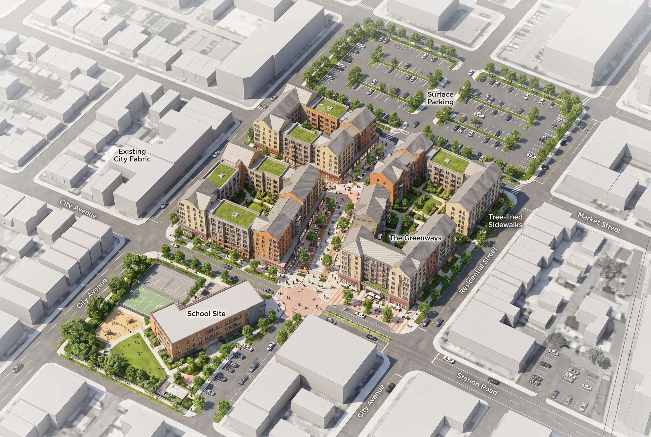
Aerial / bird’s-eye
This is the context shot. It shows where the building is, what is around it, how it relates to roads, public transport, and existing infrastructure. For a masterplan, this is often the single most-viewed image on the sales site. Skimping here is a mistake — the questions an aerial answers (is there a school nearby, is there parking, what is on the other side of the road) are exactly the questions buyers and investors ask first.
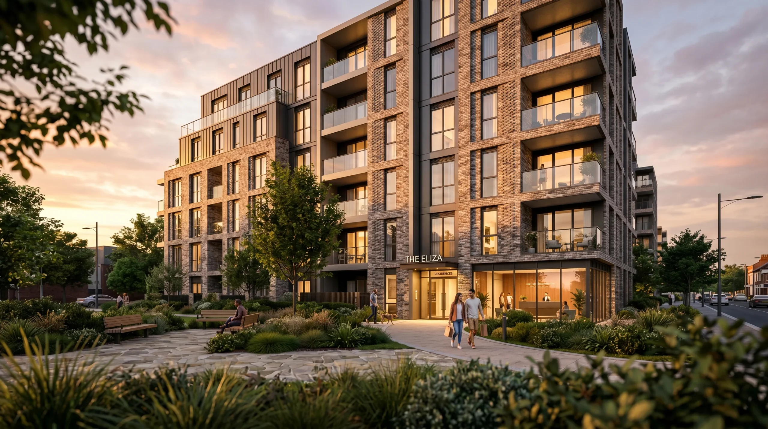
Street-level approach
The shot from human eye-level on the sidewalk. It tells people what the building feels like to walk up to. Materials read at this distance. Proportions read at this distance. If the architect made a careful decision about the entrance — a recess, a canopy, a colour shift — this is where it shows up.
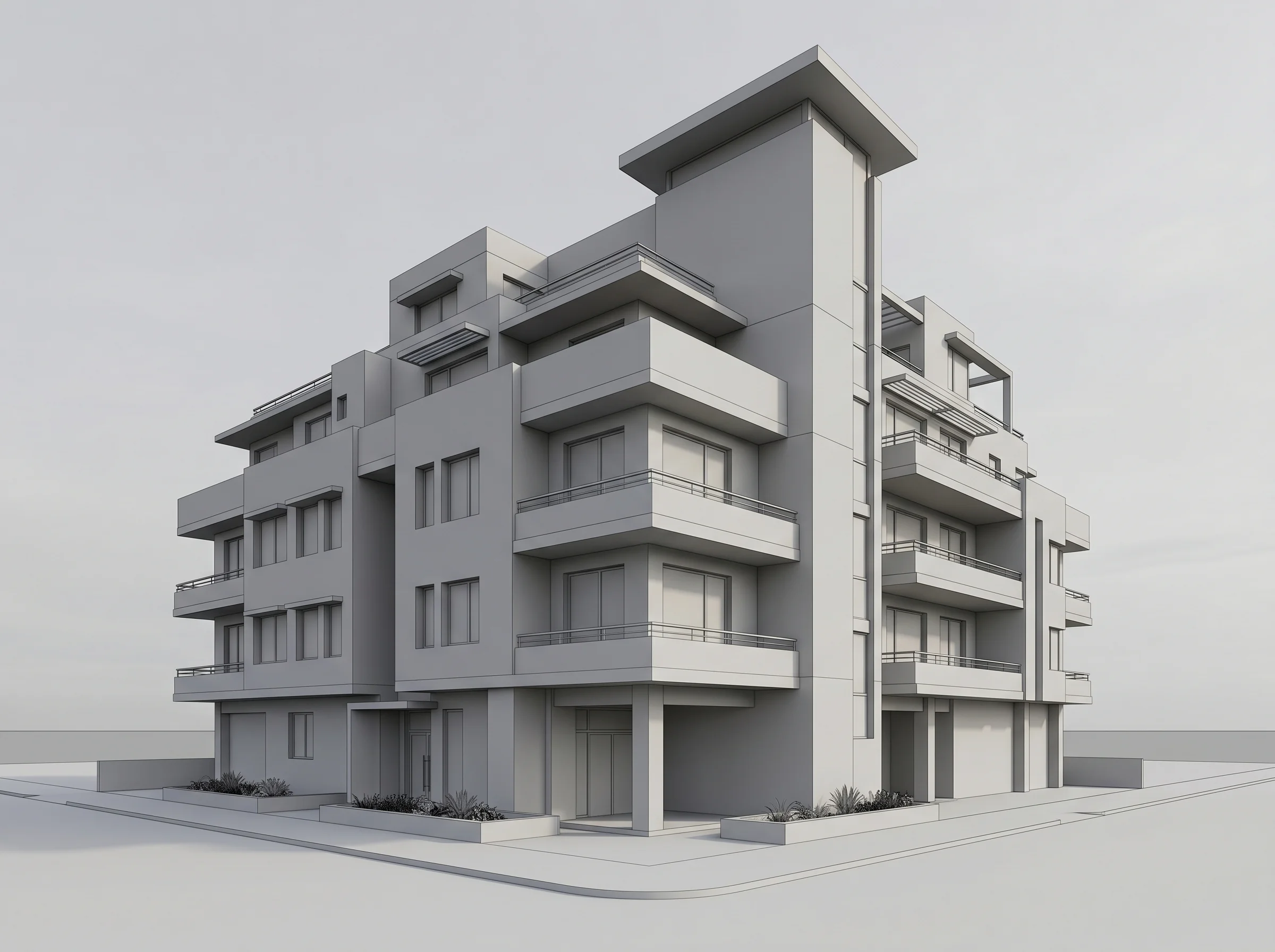
Facade close-up
Tight framing on materials, details, balconies, decor. Use these when the project’s value is partly in the craftsmanship — brick, stone, metalwork, joinery, fenestration. Without close-ups, all mid-rises start to look like the same render.
Courtyard and entry
The transition from public street to private property. Lobby door, ground-floor amenities, landscaping, lighting. For multifamily developments this is where a lot of buyer anxiety lives — is the entrance safe, is it well-lit, does the door feel like home or like a hotel.
Amenity and commercial spaces
If the project includes ground-floor retail, a co-working space, a school site, or any commercial component, those need their own renders. They support a different sales conversation (commercial leasing, planning approval) and they reassure residential buyers that the surrounding infrastructure is actually there.
Interior sets
One or two typical-unit interiors, framed around the spaces that sell — kitchen, living, primary bedroom, balcony view. The view-from-the-balcony render is underrated. For pre-construction sales it is often the deciding image, because that is what the buyer is actually buying.
Stills, animation, or interactive — when each one is worth it
Stills do the heavy lifting on most projects. They are cheaper, they are easier to use across print, web, and presentations, and they hold up. For a single building of normal complexity, a strong set of stills is usually enough.
Where stills stop being enough is when the project relies on motion, scale, or spatial sequence to make sense. A coastal villa where the value is in the approach down the driveway. A mixed-use scheme where the public spine is the selling point. A masterplan that only reads from above. For those, architectural animation answers questions a still cannot — how the camera moves through the volume, how the spaces connect, how the daylight changes from front to back.
For off-plan apartment sales, a 3D walkthrough of the project often does more work than the brochure. It lets a buyer step inside a unit that does not yet exist, change their angle, and decide whether the layout actually fits how they live. That is a different question than “is the building attractive,” and stills do not really answer it.
What we wish more clients pushed back on
Three things, consistently:
- Lock the camera angle before the materials conversation. Half the value of a clay render is that everyone shuts up about texture choices until the camera is settled. Approving materials on a bad angle wastes a revision round.
- Stop adding renders. Start cutting them. Eight strong angles beat sixteen mediocre ones. The marketing team will always ask for one more. The right answer is often no.
- Treat sky, season, and time of day as design decisions. A sunset render and a noon render of the same facade tell completely different stories. Pick on purpose.
Where renders sit in a real-estate sales pipeline
This is the part most studios undersell. A rendering set is not just a brochure asset. It is the spine of the sales process: site billboards, pitch decks for investors, the project website, broker presentation packs, social ads, planning submissions, and — if the project warrants it — the walkthrough that runs on a tablet in the sales suite. We have written separately about how renders help real-estate teams move inventory faster, and the short version is that the same image gets reused across far more touchpoints than people budget for.
When you scope a render package, scope it for that whole pipeline. Not just the first place it will appear.
One honest note on what renders cannot do
A render will not save a bad layout. If the floor plan does not work, no amount of sunset light fixes it. The right move is to use the visualization stage as a sanity check on the design — sometimes a render reveals a sightline or a shadow problem that nobody saw on the plan. Catching that before construction is one of the more boring, valuable things archviz quietly does.
That is the real argument for spending properly on 3D renderings for architectural design. Not because the pictures are pretty. Because the cost of a design problem discovered at handover is several orders of magnitude higher than the cost of catching it in the render.